
Hello,
we have used two logos in the past for flashrom. The one most are familiar with is actually a generic icon stemming from coreboot's "Related Tools" section, i.e.: http://www.coreboot.org/images/a/ae/Chip_tools.png This is not only set up as the "Mediawiki" icon on flashrom.org but is also used on our Twitter account and other sites like openhub (https://www.openhub.net/p/flashrom)
The second logo was specifically designed for this purpose and was used at various occasions in presentation slides and on marketing materials (e.g. posters). Namely http://3.bp.blogspot.com/_PTt3TWYKjnQ/TI_oZ3cqvaI/AAAAAAAAALY/eLvM6K16Glw/s4... (the one described as "Different style of bolt" on http://kmacphail.blogspot.de/2010/09/flashrom-logos.html) I think that one is way lesser known since even I was not really aware about the fact that it kind of the "official" logo at the moment.
I am not too happy with either. The hammer logo has grown dear to me... the hammer perfectly symbolizes the force we have to exert to get some systems to work and the logo as such is very recognizable. But... I only have it in very low quality... is there a better source for it? It also does not represent our generally gentle and cautious approach when dealing with hardware and our focus on stability.
The DIP logo on the other hand is available in SVG (at least Carl-Daniel has it AFAIK), but it looks a bit inanimate. The major problems I have with it are that it is not even nearly rectangular and it is very complex. There is the text with the lightning bolt replacing the h character and the DIP32 chip. Both is ok for posters and other big displays but sucks for other uses where simple, rectangular icons are required.
I have spent the last weekend with playing around with Blender and its freestyle renderer that is able to output SVG directly. I have managed to render a 3D model of a SOIC8 chip that way as a base for a possible new logo. It required some cleanup afterwards but it looks way better than everything I could draw by hand ;)
I have made two logos that I think are worth sharing. They are quite similar and the only major difference is the orientation of the chip... I have created 3 versions of each: one fully colored, one with outlines only and a two-colored simple version (e.g. for PCB silkscreens). I have attached the Inkscape SVGs as well as 96 pixel-wide PNG exports. I have not decided on an appropriate license... probably something similar to how the coreboot hare is licensed.
What do you think about my suggestions and the whole matter? I would love to see proposals for alternatives as well!

Stefan Tauner wrote:
What do you think about my suggestions and the whole matter?
soic8_30degrees is really good. I would only suggest to perhaps rotate around the X axis a little bit, and to either make the lightning bolt smaller or perhaps just remove it, because the connection between lightning and memory chips isn't so obvious.
//Peter
Peter Stuge wrote:
Stefan Tauner wrote:
What do you think about my suggestions and the whole matter?
soic8_30degrees is really good. I would only suggest to perhaps rotate
clockwise
around the X axis a little bit,
to view the chip more from the side, rather than from above.
//Peter

Wow, I love these, and I agree with peter's ideas too. This is great.
On Sat Feb 21 2015 at 5:27:35 PM Peter Stuge peter@stuge.se wrote:
Peter Stuge wrote:
Stefan Tauner wrote:
What do you think about my suggestions and the whole matter?
soic8_30degrees is really good. I would only suggest to perhaps rotate
clockwise
around the X axis a little bit,
to view the chip more from the side, rather than from above.
//Peter
-- coreboot mailing list: coreboot@coreboot.org http://www.coreboot.org/mailman/listinfo/coreboot
On Sun, 22 Feb 2015 02:26:19 +0100 Peter Stuge peter@stuge.se wrote:
Peter Stuge wrote:
Stefan Tauner wrote:
What do you think about my suggestions and the whole matter?
soic8_30degrees is really good. I would only suggest to perhaps rotate
clockwise
around the X axis a little bit,
to view the chip more from the side, rather than from above.
I am not sure where your X axis and origin is, but I have rotated it 30° "back" around the Y axis now :) Is that what you meant? That makes the flash look a bit stupid and makes the whole thing way less recognizable IMHO.
Stefan Tauner wrote:
soic8_30degrees is really good. I would only suggest to perhaps rotate
clockwise
around the X axis a little bit,
to view the chip more from the side, rather than from above.
I am not sure where your X axis and origin is, but I have rotated it 30° "back" around the Y axis now :) Is that what you meant?
I don't get the description but the result is as I meant. I agree that it is much less recognizable. Worth a shot. Maybe rotate a bit less.
I think the flash chip looks "closer" now than when viewed from the top.
Lightning bolt or not, and all the rotation, is all up to you. I just expressed some ideas.
Kind regards
//Peter
On Mon, 23 Feb 2015 00:50:46 +0100 Peter Stuge peter@stuge.se wrote:
I don't get the description but the result is as I meant. I agree that it is much less recognizable. Worth a shot. Maybe rotate a bit less.
logo with half of the rotation attached (15° instead of 30° backwards).
Stefan Tauner wrote:
logo with half of the rotation attached (15° instead of 30° backwards).
I really like this one. Nice!
//Peter
Very nice. I like the one on the left best.
On Tue Feb 24 2015 at 8:52:26 AM Peter Stuge peter@stuge.se wrote:
Stefan Tauner wrote:
logo with half of the rotation attached (15° instead of 30° backwards).
I really like this one. Nice!
//Peter
-- coreboot mailing list: coreboot@coreboot.org http://www.coreboot.org/mailman/listinfo/coreboot
On Sun, 22 Feb 2015 02:16:57 +0100 Peter Stuge peter@stuge.se wrote:
either make the lightning bolt smaller or perhaps just remove it, because the connection between lightning and memory chips isn't so obvious.
Removing it (without replacement) is not an option... that would make it simply a chip icon. That by no means qualifies as a good logo for a software project :) The logo's background idea does not have to be obvious (i.e. if one doesn't know it is related to flashrom, one does not necessarily need to derive that relationship), but it should be recognizable and clear once you know it to make the whole logo<->project relation memorable... and I really think that a flash and a rom/chip qualifies to represent flashrom in such a way :)

Hi,
On 22.02.2015 02:04, Stefan Tauner wrote:
we have used two logos in the past for flashrom. The one most are familiar with is actually a generic icon stemming from coreboot's "Related Tools" section, i.e.: http://www.coreboot.org/images/a/ae/Chip_tools.png This is not only set up as the "Mediawiki" icon on flashrom.org but is also used on our Twitter account and other sites like openhub (https://www.openhub.net/p/flashrom)
The second logo was specifically designed for this purpose and was used at various occasions in presentation slides and on marketing materials (e.g. posters). Namely http://3.bp.blogspot.com/_PTt3TWYKjnQ/TI_oZ3cqvaI/AAAAAAAAALY/eLvM6K16Glw/s4... (the one described as "Different style of bolt" on http://kmacphail.blogspot.de/2010/09/flashrom-logos.html) I think that one is way lesser known since even I was not really aware about the fact that it kind of the "official" logo at the moment.
That logo (with slight modifications) was used in all flyers, all presentations and at all booths since 2010. Please see the attachment for details.
I am not too happy with either. The hammer logo has grown dear to me... the hammer perfectly symbolizes the force we have to exert to get some systems to work and the logo as such is very recognizable. But... I only have it in very low quality... is there a better source for it? It also does not represent our generally gentle and cautious approach when dealing with hardware and our focus on stability.
To me, the hammer logo suggests "chip tool" in a general way, not something related to flash chips. Besides that, nowadays PLCC32 flash chips are almost extinct.
The DIP logo on the other hand is available in SVG (at least Carl-Daniel has it AFAIK), but it looks a bit inanimate. The major problems I have with it are that it is not even nearly rectangular and it is very complex. There is the text with the lightning bolt replacing the h character and the DIP32 chip. Both is ok for posters and other big displays but sucks for other uses where simple, rectangular icons are required.
I don't really understand the requirement for a rectangular logo. "flashrom" is a long word and if we want to place that word below any logo, the logo will either need to be strechted out (like the one attached to this mail) or it will be a bit clumsy due to its blobby size.
There is another question: Do we want a logo which can be used without the word "flashrom", and if so, should it still look good when the word "flashrom" is written below?
I have spent the last weekend with playing around with Blender and its freestyle renderer that is able to output SVG directly. I have managed to render a 3D model of a SOIC8 chip that way as a base for a possible new logo. It required some cleanup afterwards but it looks way better than everything I could draw by hand ;)
The result looks nice, but I have trouble associating this with flashrom. The lightning bolt is a bit difficult to recognize as a lightning bolt.
I do like that you used an 8-pin chip instead of a 32-pin chip. Looks more modern.
I have made two logos that I think are worth sharing. They are quite similar and the only major difference is the orientation of the chip... I have created 3 versions of each: one fully colored, one with outlines only and a two-colored simple version (e.g. for PCB silkscreens). I have attached the Inkscape SVGs as well as 96 pixel-wide PNG exports. I have not decided on an appropriate license... probably something similar to how the coreboot hare is licensed.
What do you think about my suggestions and the whole matter? I would love to see proposals for alternatives as well!
I would like to keep the SVG logo used since 2010, perhaps paired with a simplified version of the logo which is small and simple enough for square icons.
What do you think about having a DIP8 chip for icons and other space-constrained and detail-constrained applications? This would allow us to have two logos, each one for the purpose it fits best.
There is also the question of whether we want a pure black-and-white logo like coreboot or if we'll go full/partial color. For posters, black-and-white vs. color is a matter of cost.
Regards, Carl-Daniel
Carl-Daniel Hailfinger wrote:
two logos
I'd recommend avoiding that. It becomes confusing for people.
//Peter
On Wed, 25 Feb 2015 03:38:01 +0100 Peter Stuge peter@stuge.se wrote:
Carl-Daniel Hailfinger wrote:
two logos
I'd recommend avoiding that. It becomes confusing for people.
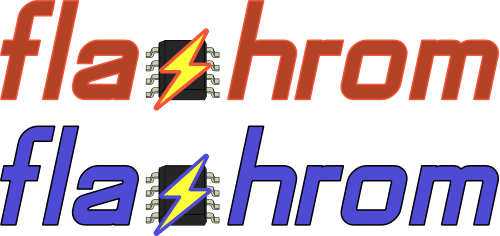
Not necessarily... the facebook "f" or linkedin "in" are examples where parts of the lettering are reused in icons. Based on that idea I have created a lettering containing the SOIC chip and bolt. I doubt this would produce any confusion :)
Hi,
I have put most of my creations online together with some of the (old) alternatives and created a poll that should help finding the most popular ones. Please vote only once (the site will not try to inhibit multiple votes).
http://epicdecide.com/bac504d1-0061-46c4-ac7c-9beecaba87e0/
The images are shown in random order which makes it a bit hard to compare similar ones... just follow your gut feeling or look at them more closely here: http://buildbot.flashrom.org/poll/
You can enter a name at the bottom which I would appreciate. (I can only see the name not how anybody has voted). Any additional comments are very much welcomed! If you think all of them are crap and you have some better ideas I'd like to hear them too :)

Not that I care much, but I can't help it: this new symbol looks very much like the infamous SS Bolts: http://www.adl.org/combating-hate/hate-on-display/c/ss-bolts.html#.VPSXeFX3-...
--vb
On Sat, Feb 28, 2015 at 1:59 PM, Stefan Tauner stefan.tauner@alumni.tuwien.ac.at wrote:
Hi,
I have put most of my creations online together with some of the (old) alternatives and created a poll that should help finding the most popular ones. Please vote only once (the site will not try to inhibit multiple votes).
http://epicdecide.com/bac504d1-0061-46c4-ac7c-9beecaba87e0/
The images are shown in random order which makes it a bit hard to compare similar ones... just follow your gut feeling or look at them more closely here: http://buildbot.flashrom.org/poll/
You can enter a name at the bottom which I would appreciate. (I can only see the name not how anybody has voted). Any additional comments are very much welcomed! If you think all of them are crap and you have some better ideas I'd like to hear them too :)
-- Kind regards/Mit freundlichen Grüßen, Stefan Tauner
-- coreboot mailing list: coreboot@coreboot.org http://www.coreboot.org/mailman/listinfo/coreboot
Thanks to everyone who has voted on the initial vote!
It has helped me a lot already to rule out a number of variations. It also showed clearly that the old logo is not popular at all and that manual kerning is preferred to default letter spaces (I am using the FreeMono font, which is monospaced so this is not too much of a surpise).
There are some other variables I'd like you to decide. There was some discussion about the flash outline already so I will create at least two sets of icons for that later. Maybe I'll try different fonts too, but I'd like to use a very common one and I think the FreeMono font suites us well... command line tool etc.
Anyway... first I'd like to define the color (scheme) to use. I have created another poll, please vote! http://epicdecide.com/3dc56f58-59f9-4921-b048-4cb89b48a09b/
If we go for one of the yellow schemes, an alternative for the icon would be to make it completely yellow without colored outlines like so: http://buildbot.flashrom.org/poll-colors/yellow_icon.png What do you think?
On 05.03.2015 02:05, Stefan Tauner wrote:
Thanks to everyone who has voted on the initial vote!
Are the results available?
Anyway... first I'd like to define the color (scheme) to use. I have created another poll, please vote! http://epicdecide.com/3dc56f58-59f9-4921-b048-4cb89b48a09b/
How much time do we have to vote? I had expected the old vote to stay active for at least a week.
Regards, Carl-Daniel
On Thu, 05 Mar 2015 08:58:28 +0100 Carl-Daniel Hailfinger c-d.hailfinger.devel.2006@gmx.net wrote:
On 05.03.2015 02:05, Stefan Tauner wrote:
Thanks to everyone who has voted on the initial vote!
Are the results available?
Not publicly. Apparently one CAN look at every voter's result so I won't share the link publicly. I have sent it to you yesternight already on IRC.
Anyway... first I'd like to define the color (scheme) to use. I have created another poll, please vote! http://epicdecide.com/3dc56f58-59f9-4921-b048-4cb89b48a09b/
How much time do we have to vote? I had expected the old vote to stay active for at least a week.
It is still active and I monitor its activity but I don't believe that the outcome will change much anymore. I had wished for more than the mere 18 votes so far but the confidence level of the current results are high enough for me to draw conclusions. This is also true of the second poll on the color scheme. Its result are even more distinct so far. But nothing is set in stone yet and our bikeshedding of the logo will continue... :)
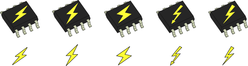
Do you know what we haven't done in a long time? A poll! ;) This time it's all about a few different flash symbols summarized in the attached image.
http://epicdecide.com/123fe27d-a4ff-4ab1-9bcd-b5efb267bdd5/
Please consider voting in the first two polls if you have not yet:
Basic choices: http://epicdecide.com/bac504d1-0061-46c4-ac7c-9beecaba87e0/
Colors: http://epicdecide.com/3dc56f58-59f9-4921-b048-4cb89b48a09b/
This will be the last poll that evaluates specific features of the logo. There may be another one to determine the final design.
I have selected a variety of fonts that I think are OK for a logo in terms of thickness and "playfulness". Not all of them are free but I have included them in the poll anyway to get a better feeling about general preferences.
http://epicdecide.com/ad3645e6-9a70-4cce-bd05-bf0e66e668e9/
On Sun, 8 Mar 2015 18:07:51 +0100 Stefan Tauner stefan.tauner@alumni.tuwien.ac.at wrote:
Do you know what we haven't done in a long time? A poll! ;) This time it's all about a few different flash symbols summarized in the attached image.
http://epicdecide.com/123fe27d-a4ff-4ab1-9bcd-b5efb267bdd5/
Please consider voting in the first two polls if you have not yet:
Basic choices: http://epicdecide.com/bac504d1-0061-46c4-ac7c-9beecaba87e0/
Colors: http://epicdecide.com/3dc56f58-59f9-4921-b048-4cb89b48a09b/
On 11.03.2015 14:30, Stefan Tauner wrote:
This will be the last poll that evaluates specific features of the logo. There may be another one to determine the final design.
I have selected a variety of fonts that I think are OK for a logo in terms of thickness and "playfulness". Not all of them are free but I have included them in the poll anyway to get a better feeling about general preferences.
This is the first poll where I think that all of the options suck. Traditionally, flashrom is written all lowercase and I would love to keep it that way. However, the letter "f" in the logos sucks in all lowercase variants because of a IMHO way too high lateral stroke. That's something I didn't like about the intermediate official logo, by the way.
Does anyone know a font where the lowercase "f" doesn't look like a design error?
Regards, Carl-Daniel
On Fri, 13 Mar 2015 08:37:49 +0100 Carl-Daniel Hailfinger c-d.hailfinger.devel.2006@gmx.net wrote:
On 11.03.2015 14:30, Stefan Tauner wrote:
This will be the last poll that evaluates specific features of the logo. There may be another one to determine the final design.
I have selected a variety of fonts that I think are OK for a logo in terms of thickness and "playfulness". Not all of them are free but I have included them in the poll anyway to get a better feeling about general preferences.
This is the first poll where I think that all of the options suck. Traditionally, flashrom is written all lowercase and I would love to keep it that way. However, the letter "f" in the logos sucks in all lowercase variants because of a IMHO way too high lateral stroke. That's something I didn't like about the intermediate official logo, by the way.
Does anyone know a font where the lowercase "f" doesn't look like a design error?
Well, that's more than subjective because the stroke is in the upper third or even quarter in almost all common fonts. And those where it is lower are usually completely unusable for a logo (extremely squiggly).
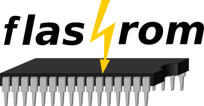
However, I am aware of one font, that might work... I have used it for a caps lettering already: Chaerilidae I have attached a lower-case variant with that font. What do you think about it?
Other suggestions for fonts are welcome...

How about making flashrom available for Bay Trail architecture?
13 mar 2015 kl. 14:36 skrev Stefan Tauner stefan.tauner@alumni.tuwien.ac.at:
On Fri, 13 Mar 2015 08:37:49 +0100 Carl-Daniel Hailfinger c-d.hailfinger.devel.2006@gmx.net wrote:
On 11.03.2015 14:30, Stefan Tauner wrote:
This will be the last poll that evaluates specific features of the logo. There may be another one to determine the final design.
I have selected a variety of fonts that I think are OK for a logo in terms of thickness and "playfulness". Not all of them are free but I have included them in the poll anyway to get a better feeling about general preferences.
This is the first poll where I think that all of the options suck. Traditionally, flashrom is written all lowercase and I would love to keep it that way. However, the letter "f" in the logos sucks in all lowercase variants because of a IMHO way too high lateral stroke. That's something I didn't like about the intermediate official logo, by the way.
Does anyone know a font where the lowercase "f" doesn't look like a design error?
Well, that's more than subjective because the stroke is in the upper third or even quarter in almost all common fonts. And those where it is lower are usually completely unusable for a logo (extremely squiggly).
However, I am aware of one font, that might work... I have used it for a caps lettering already: Chaerilidae I have attached a lower-case variant with that font. What do you think about it?
Other suggestions for fonts are welcome...
Kind regards/Mit freundlichen Grüßen, Stefan Tauner <chaerilidae-lower-carldani.png>-- coreboot mailing list: coreboot@coreboot.org http://www.coreboot.org/mailman/listinfo/coreboot
Hej Berth-Olof,
Berth-Olof Bergman wrote:
How about making flashrom available for Bay Trail architecture?
I think there is interest in that.
You can go ahead and send the neccessary patches.
Thanks
//Peter
On Fri, 13 Mar 2015 14:36:35 +0100 Stefan Tauner stefan.tauner@alumni.tuwien.ac.at wrote:
On Fri, 13 Mar 2015 08:37:49 +0100 Carl-Daniel Hailfinger c-d.hailfinger.devel.2006@gmx.net wrote:
On 11.03.2015 14:30, Stefan Tauner wrote:
This will be the last poll that evaluates specific features of the logo. There may be another one to determine the final design.
I have selected a variety of fonts that I think are OK for a logo in terms of thickness and "playfulness". Not all of them are free but I have included them in the poll anyway to get a better feeling about general preferences.
This is the first poll where I think that all of the options suck. Traditionally, flashrom is written all lowercase and I would love to keep it that way. However, the letter "f" in the logos sucks in all lowercase variants because of a IMHO way too high lateral stroke. That's something I didn't like about the intermediate official logo, by the way.
Does anyone know a font where the lowercase "f" doesn't look like a design error?
Well, that's more than subjective because the stroke is in the upper third or even quarter in almost all common fonts. And those where it is lower are usually completely unusable for a logo (extremely squiggly).
However, I am aware of one font, that might work... I have used it for a caps lettering already: Chaerilidae I have attached a lower-case variant with that font. What do you think about it?
Other suggestions for fonts are welcome...
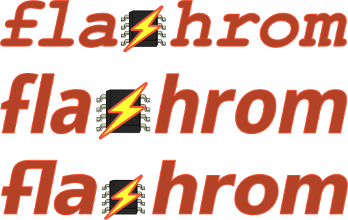
The other possibility - changing the fs in existing fonts - looks terrible IMHO (at least when I do it). See attachment for 3 attempts.
-
 Berth-Olof Bergman
 -
 Carl-Daniel Hailfinger
 -
 Peter Stuge
 -
 ron minnich
 -
 Stefan Tauner
 -
 Vadim Bendebury